TeamSnap Dashboard
UX + UI Design, Visual Design
Introduction
TeamSnap’s Sports Org product is a an all in one platform for sports businesses of all sizes and sport to manage their business. Smaller organizations might have less than a hundred members across a handful of teams, while larger ones may have up to 10,000 members and over a hundred teams. Features range from scheduling games, running tournaments, league standings, managing locations, organizing teams, messaging members, invoicing, registration, data exports and so on.
Originally it was built as an MVP by duplicating the team product then adding in capabilities to link multiple teams together and organize them within divisions. Given that, there wasn’t always a lot of initial thought into usability of the app, more just the basic functionality. There were a number of issues ranging from onboarding and reporting, to member management and so on.
In the spring of 2019, execs at TeamSnap decided to run a company wide hackathon where teams were assigned, but teams were able to work on any user problem they wanted. I saw this as a chance to fix some of the issues I was seeing with the app, so decided to volunteer as a team lead.
My Role
Team Lead, Product Designer, Product manager, Front End Dev
- Designed the components and dashboard as a whole
- Wireframes and fully polished designs
- Ran cross functional brainstorming session
- Ran Journey mapping sessions with CX and sales
- Led collaboration and design review throughout the project
- Put together the project board in InVision
- Worked with the team to plan out development cycles
- Wrote the html and css for the graphs
- Wrote React, HTML and CSS for the parts of the the getting started panel and as space
- Wrote Ruby, HTML and CSS for the tab reorder and no data screens on tabs
The Challenge
Project Timeline
This may have been the most challenging part of the project. Being a hackathon project, there was a very limited timeline. We had 1 month to identify a user problem, agree upon it as a team and design a solution. Then at the end of that month, we had 1 week to build it.
Identifying a Problem
To kick things off I scheduled a meeting for the team to pair with customer facing parts of the company like sales and CX to better understand our users and their issues. We discussed some user pain points, their journey as a whole and some potential opportunities.

Key Journey Mapping Insights:
- Users had issues with creating a team and divisions. There was uncertainty about what to do with a division and sometimes it’s easier to do after knowing who’s playing this season.
- Users have to hunt and peck through the tabs to figure out what the proper next step is. There was no clear guidance around where to start and what to do next.
- After purchasing, users often feel let down and abandoned since its not as intuitive as the team product and they no longer have someone holding their hand along the way.
- As users get past onboarding it’s also hard to see how their org is doing. It's hard to manage the org as a whole and actually run a business, just manage teams and games. Users had to export spreadsheets from the app and piece together the info to run their business.
There was data to back all this up too. We were seeing extremely low product adoption without a personal onboarding from CX. Less than 20% success without onboarding vs greater than 85% adoption with a personal CX onboarding.

Reviewing the Onboarding UX
When comparing notes from the journey mapping session to the UI it was really easy to see that we weren’t doing much to help them get started.
- There was little to no info in the welcome email and their first screen when after navigating to their org is a choice to add a team or division, which we know isn’t necessarily a choice they can easily make off the bat.
- Also when ranking the key tasks for user success, they’re very scattered through the products tab order and don’t necessarily follow a common order for setting up a sports organization.

After working with CX and reviewing the UI, we had our problem identified and agreed upon as a team. Now we just had to figure out how we might improve the user onboarding experience.
The Approach
Brainsorming as a Team
I wanted to make sure everyone was included from the start so we were all invested and in lock step throughout. We new the issues, now it was time to find a solution. So to kick this part of the project off I ran a brainstorming session with our project team as well as members from CX and sales. It was a simple prompt, how might we improve the onboarding experience for Club & League Users?.

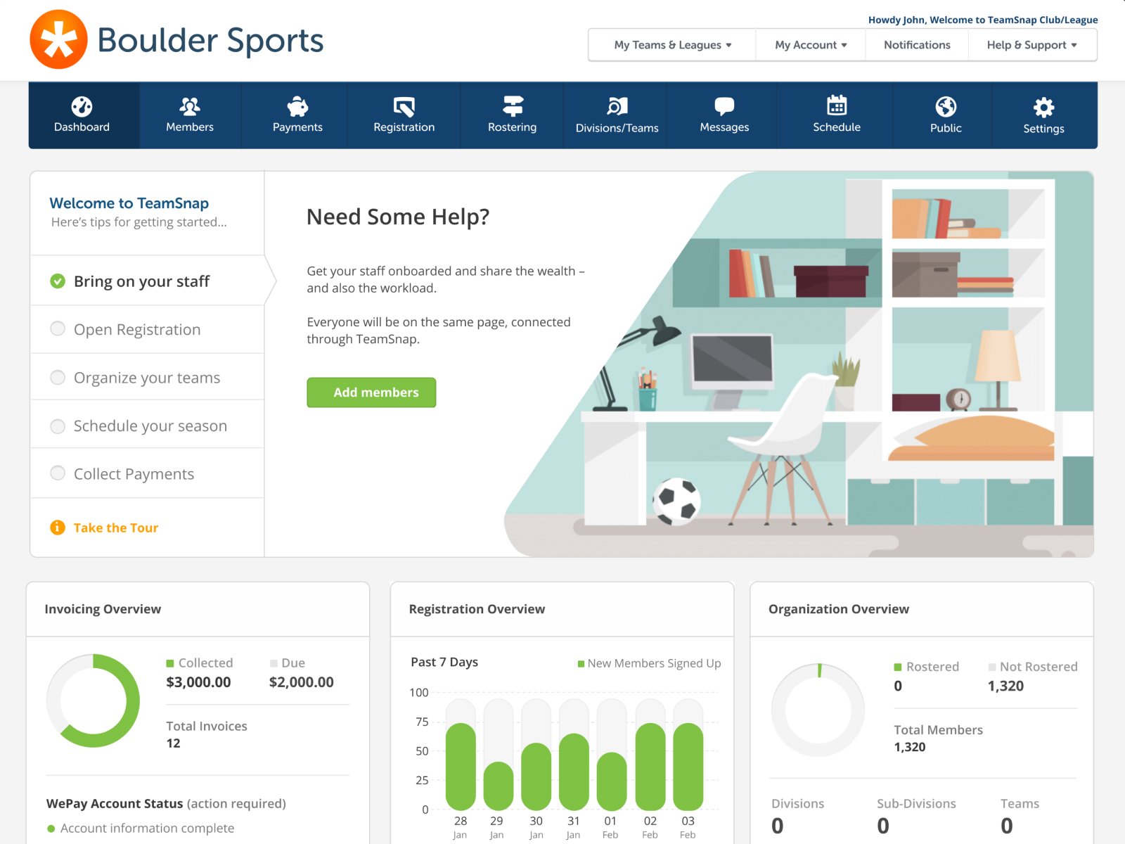
We decided to move forward with a few ideas but the primary was to build an org level dashboard that could both help new users get started with the product and give seasoned users a space to see a consolidated overview of key org functions.
However, a dashboard can consist of a lot of things and provide a lot of detail into many things, so I added one more cross department brainstorming session so we could dive more into specifics of content & functionality to include at different stages of the customer journey.

Refining & Scoping
I then took those ideas and started mocking up how they might work in a set of componentized widgets. Below are a just a couple examples. We went through a process of vetting scope on a handful of ideas, talking through endpoints that would be required, ones we already had and level of difficulty in the new ones that were needed.

State management was also a key talking point since we many of these widgets would ideally change based on the stage of the journey the user was in. Getting started would go away after completing all the tasks and the body widgets would respond to various system states.

While refining the the component design, as issued popped up I would hop on quick meetings with devs to discuss and find solutions that both solved the user problem and fit well within the timeline we were working with.

As different components became more defined from a technical standpoint I started adding in the visual design and outlining any added details so we could hit the ground running the week of development.

With the scope of the work being so well defined heading into the week and the truly agile mentality of the team, we felt confident we could get it all done heading into the week of development.
Putting it Together
Throughout this whole project we really tried to anchor design decisions and component states to the customer journey, both in each individual component and the dashboard as a whole. The week of development was no different. All the parts and pieces we're outlined and divided up to various team members based on skill set.

As we started building though, everyone jumped in and contributed where they could to meet the goal. Backend devs and design wrote react, react devs created endpoints and QA & PMs created AppCues walkthroughs. If someone had time to pick up something a little outside their skill set, another team member would walk them through a few pointers to get them up and running. I walked our PM & QA through Appcues, our backend devs walked the front end devs through creating an endpoint and everyone picked up what they could.


Early collaboration between the entire team was really effective in defining scope and getting everyone excited about the project. We not only built the full dashboard in 1 week, but expanded beyond that to onboarding emails and other onboarding touch points.
Rounding Out the Experience
With the dashboard work coming to an end, I started going back and knocking out some of the smaller projects that played off of and enanced the dashboard changes. For example paring with marketing to update the email to provide more direct entries into specific tasks, then update the screens they landed on had much more contextual help to get them going.

And updated reorder the tab structure to flow that better follow the user journey; “being people in”, “organize them on teams” and “run the day to day operations”.

Next Steps
The one piece I think that was missing from this project was measuring the impact it had. From talking with CX, Sales and users, we knew it had a positive effect, but didn't have the analytics in place to really understand the quantitative impact of our efforts. We had some click tracking setup and could see usage of the dashboard, but looking back I'd like run an A/B test measure some of the other effects of the dashboard.
