TeamSnap Search Patterns
UX, UI, Research, Design Systems
Introduction
TeamSnap’s Sports Org product is a an all in one platform for sports businesses of all sizes and sport to manage their business. Smaller organizations might have less than a hundred members across a handful of teams, while larger ones may have up to 10,000 members and over a hundred teams. Features range from scheduling games, running tournaments, league standings, managing locations, organizing teams, messaging members, invoicing, registration, data exports and so on.
Now, the current product only handles one season at a time but our upcoming plans include features like cross season member management which would bring the potential number of users on the system from 10k to 20k, 30k, 40k members spread across hundreds of teams in past and present seasons.
Our general product strategy moving forward is geared around bringing reporting in app too. A lot of our competitors also relied on data exports as the way to satisfy reporting needs and as a whole their products were very disjointed. We viewed easy access to data that helps them run their business as a big differentiator. Search is a backbone for surfacing that data.
My Role
Product Designer, Researcher
- Led design of both implementations as well as the patterns.
- Led Research for the qualitative, quantitative and competitor analysis to define requirements.
- Led team discussions around choosing an option and worked with team on defining scope.
- Paired with PMs on measures of success and some of the qualitative analysis
- Collaborated with back end developers on search capabilities given the limitations of our data structure.
- Provided CSS guidance to front end developers on how to build the UI for the new searches patterns.
The Challenge
Our search experiences weren't great to say the least and we were getting a lot of negative feedback from our customers. We had other searches in places like invoicing, messaging and reporting, some better than others, but all of them inconsistent and hard to use. With Rostering, we made some search updates in the past but never really set a great foundation, so over time search inputs piled up as new requirements came in and different teams added on. Every solution was a one off and it showed.
“It’s not always clear who is showing up in results and why”
“Search is intimidating and hard to use”
“I wish it was easier.”


Digging into FullStory and running some un-moderated user tests, there were a handful of things that stood out pretty quickly. When one of those issues caused an invalid search, all the other issues were magnified as the user tried to evaluate the UI and self correct. Frustration and abandonment was the usual result.

Points of Search Contention:
- We’re applying search criteria without any indication. This is likely the leading cause of confusion, because if someone searches for members on a team and doesn't notice that we automatically remove them from the ui, it doesn't reflect their mental model of who is on the team.
- Users read this as “I want to see this AND this AND this..” confusing it with "OR" logic. Once users get tripped up, a common use pattern is to add more filters thinking that will widen the scope when in fact it does the opposite.
- The false “active” states add to the difficulty of reading the page. In user testing something noticed was that when people start hitting these dead ends and looking around at the UI to self correct, they really struggle to make sense of how it all ties together.
- Having users select an operator is added complexity and slows them down. Just another piece of complexity that really isn't needed. Users typically just glance over the option or notice it and skip.
- The amount of options presented at once made it hard to find a starting point. On top of taking up so much space and pushing the actions below the fold, a lot of users in testing mentioned how scary, intimidating or overwhelming the search was to get started with. This matched internal and customer feedback.
- It’s so much smoother when they don’t need to deal with the search. More just a note for the future, but if we can surface data as they need it, without forcing them to search, that would be the most ideal solution.
Our search experiences needed to be simple, consistent and relatable. The needed to be easy for anyone to use without any context or knowledge of the system.
The Approach
Strategy
A systematic solution for searching
After watching different teams work on the same search experiences across the app and seeing them approach each problem quick fix to solve 1 issue at a time, I felt like there was better approach. I decided to approached these search updates as a system, a path forward, rather then a quick fix. I wanted to build a search experience that scaled across the app.

Research
The goal was to see if I could determine any intent. Based on some conversations with customers, our assumption was that members would be more specific, focused on finding individuals vs rostering which is more about building segments of users.
That assumption proved out to be true, but we also got some really good info for setting scope and selecting what criteria was needed on which feature.

Members Tab Takeaways:
- First Name and Last Name are hands down the most used criteria
- Email was third, then team or division next
- Almost always just a single criteria used

Rostering Tab Takeaways:
- Whether or not they were on a team was easily the most used
- Registration was next with about 45% of the searches
- Custom fields and gender were next at around 10% usage
- Name searching was getting some usage for individual actions
- Generally speaking there were multiple pieces of criteria used
It seemed like there were 2 primary use cases to solve for. Finding a specific person to take an action on and finding groups of similar people bulk actions on.
Reviewing Other Search Experiences
With those 2 use cases in mind, I started looking around different search experiences to see how they we're solving those uses cases.

Since our users we're primarily parents of children on travel sports teams, I initially started looking at travel sites and popular social media sites, then expanded out to other interesting search UX. Spokeo had an interesting case study about how they simplified a complex search UI.

Search research Takeaways:
- AirBnb did a really nice job at having users give 1 primary piece of search criteria, then following up with categorized filters. It made entering multiple pieces of criteria feel effortless and intuitive.
- Facebook did a nice job at condensing everything down into a single input. Google does too.
- Spokeo was a nice middle ground between the two. I liked how they had a single search input, except what that searched was broken up into categorize.
Defining Patterns & Principles
Based on my findings from Fullstory, UserTesting, Search Data and comparative research I started defining a few basic patterns and principles to help drive consistency throughout various search projects. As I was defining those patterns, I made sure to apply them to potential search sceneries to see how they fit.
Applied search criteria must have an indicator otherwise users are starting with a false data set and we’re breaking their mental modal of the data from the start.
Categorize inputs to guide users to successful searches By organizing inputs into categories we can help users enter better combinations of criteria and give them clearer paths in compound searches. Ideally building around the most important piece of criteria then giving them the means to refine or change that initial search type.

This can be expanded upon for complex segment builders by giving them categories to interact with. Those categorizations of search inputs builds can be built up to satisfy varying complexity of needs; ranging from a single input to many.

- Condense inputs to remove complexity By removing options they don’t need and condensing complex options we can limit the clicks needed as well as remove extraneous inputs that lead to invalid searches. For example first, last and an operator into a single full name input. Stepped inputs like registration form, fee and option could also benefit from this approach; especially with a Type Ahead component.

Make applied search criteria human readable So favor text strings over conditional logic and large groups of menu options so it takes less work to understand what criteria is applied.
User intent should drive the design Really consider the primary goal of the feature and how search facilitates that, then make it unique to that goal. At TeamSnap, search wasn't the primary experience, just a means to another task.
Project Details
Members Tab
The primary use case here was to help admins easily find a specific person. So initially after reviewing some of the search research with the team we wanted to dive into that notion of a condensed search input, using tool called Type Ahead. The team felt that was the most streamlined way for users to find someone.

However, the scope of the Type Ahead component was just too much, because that meant all member, team and registration data would have to be loaded and indexed in the front end. So ultimately we went with a simple text input that could be changed to changed to search by full name, email, team or registration. No matter what the search criteria was the results we're still member based. Additionally a basic "role" filter could be applied to the results, to differentiate between players, coaches and parents.

We felt like the quicker iteration was still a big improvement and really wanted to learn how it effected the time to search and action metrics as well as drop off between search and action, to see if type typeahead was needed.

Rostering Tab
With the rostering team, they initially wanted to go with the old version of member tab style search, the query builder pattern, since their was already code in place. They wanted to see how what kind of feedback users would have with that type of search experience instead of the large up front set inputs that was on the search tab.

Taking the use case of searching for groups of people on various teams and divisions and comparing the old members search interface to the new pattern driven approach though, it was easy to see that the new approach was clearly the more streamlined approach. I also found that it was also easier to understand the criteria that had been entered, since it repeated the inputs back to users in a more human readable way.

After walking through and breaking down the interactions of the new design with the team, comparing them to our goals, we decided to invest in the new categorized search pattern.

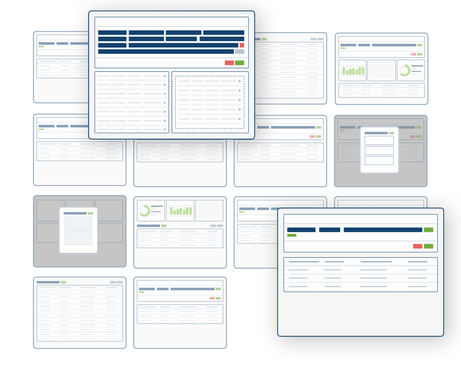
Search UI Kit
As I was working with the two teams and the two different search projects, I also started taking those patterns and building them out into a full fledge UI kit to include with our design system.

Them I gave guidance as to how they could fit in with other parts of the Club & League app. I gave examples for how these components could be used as page level filters and used in different types of searches.


Providing patterns, principles and tasks to tie our efforts back to worked well in leading discussions. It provided a focused and objective platform to speak on.
Next Steps Refining Funnels & Measuring Impact
Refine our Search Funnel
We didn’t have a lot of resources dedicated to setting up analytics so getting some of these numbers were difficult to do at scale, but measuring a small sample size through FullStory the number of bad searches had dropped to nearly nothing since we weren’t allowing it in the UI, which in term sped up time to results and ultimately time to action significantly. We didn't have a well defined funnel, but we did seem to be having a very positive impact on search abandonment rates and time to results. I think search abandonment and time to search could be measured more closely though.

Measure the Impact of Search
Then I'd like to directly correlate search funnel metrics back to larger product and business goals to try and put a dollar amount on our efforts as a team. The goal is to get it down to a formula of as x decreases, y increases by z.
